Making figures for microbial ecology: Interactive NMDS plots
This is the one of several tutorials I’m putting together for making figures that are common in microbial ecology. Today we’ll create an interactive NMDS plot for exploring your microbial community data. NMDS, or Nonmetric Multidimensional Scaling, is a method for dimensionality reduction. This works great for high demensional datasets like microbial communities and makes it visually easy to compare lots of communities to each other. We’re using NMDS rather than PCA (principle coordinates analysis) because this method can accomodate the Bray-Curtis dissimilarity distance metric, which is better suited for our community data than Euclidean distance. For this tutorial I’m using data and code from my publication in Geobiology.
First we’ll need to set up our environment in R:
#load libraries
pacman::p_load(tidyverse, plotly, vegan)
Next, read the OTU data into a dataframe. We can pull the data directy from Github by reading the raw file. You can preview the data in the table below this code chunk.
#read the data into a dataframe
otu_table <- read_delim("https://raw.githubusercontent.com/CaitlinCasar/Casar2020_DeMMO_MineralHostedBiofilms/master/orig_data/DeMMO136_Dec2015toApril2018_noChimera_otuTable_withTaxa_d10000.txt", delim="\t", comment = "# ")

metadata <- read_csv("https://raw.githubusercontent.com/CaitlinCasar/Casar2020_DeMMO_MineralHostedBiofilms/master/orig_data/metadata.csv")
First we need to normalize our data.
otu_norm <- otu_table %>%
  select(-taxonomy) %>%
  mutate_at(vars(-`#OTU ID`), funs(./sum(.)*100)) %>% #normalize to relative abundance
  gather(sample_id, abundance, `7.DeMMO1.Steri.050917`:`18.800.DitchFluid.041818`) %>%
  spread(key = `#OTU ID`,value = 'abundance') %>%
  right_join(metadata %>% select(sample_id)) %>%
  column_to_rownames("sample_id")
Now, let’s use the metaMDS function in vegan to perform NMDS. We’ll use the default distance metric, Bray-Curtis dissimilarity, and set the argument k to 2 dimensions.
NMDS_ord <- otu_norm %>%
  metaMDS(k=2)
Now let’s pull out the NMDS coordinates for axes MDS1 and MDS2 for plotting purposes.
#pull out ordination and vector coordinates for plotting
NMDS_coords <- NMDS_ord[["points"]] %>%
  as_tibble(rownames = "sample_id") %>%
  left_join(metadata)
We can create a dictionary of shapes for our plot like this:
#make shape dictionary for ploting
shape_dict <- c(0, 15, 15, 1, 19, 19, 2, 17, 17, 5, 5)
names(shape_dict) <- c("D1.fluid", "D1.inert.control", "D1.mineral", "D3.fluid", "D3.inert.control", "D3.mineral", "D6.fluid", "D6.inert.control", "D6.mineral","D3.cont.control", "ambient.control")
Now let’s plot the data!
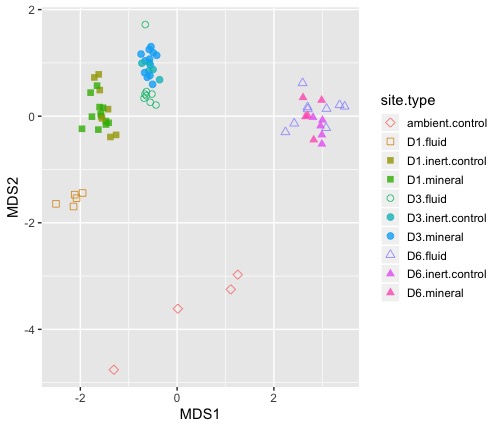
#NMDS plot with controls
NMDS_plot <- NMDS_coords %>%
  ggplot(aes(MDS1, MDS2)) +
  geom_point(size=2, alpha=0.8, aes(shape=site.type, color=site.type, label = sample_id)) +
  scale_shape_manual(values=shape_dict) +
  theme(legend.key.size = unit(.5, "cm"))


#visualize interactive plot
ggplotly(NMDS_plot)
Now we have a nice interactive plot for exploring the ordination. Easy-peasy! 😎
Fork Me